Tuesday, 8 October 2013

Research (artist) - Simon Fetscher

Simon Fetscher
Personal site link

Born Sweden 1990
Art school - Folkuniversitetets Art College in Gothenburg
Illustration School at Berghs School of Communication in Stockholm

Clients have included
  • Calmino group AB
  • Mystikal Wear
  • Dejossy
  • Sun Rise
 Has some very interesting drawings done as personal practice

talk about presentation here
http://simonfetscherweekly.blogspot.se/

Research (artist work critique) - Chris Shenglong Zhang

Class crit today, looked at Chris' current work.

My thoughts on his painting 'Searching'


Discussing the design of the figures
Some points (the robot or human) raised by classmates. This is a mixture of my own thoughts and those of my classmates. PRIMARILY my own thoughts.
Trying out a 3 point method of talking about the design - 'what is the issue' 'how has the issue been created' 'how can we solve it'.

  • Lights on side of face are a dominant focal point and draw attention away from the other more important parts of the face. Why do we need to look at the other detail? In the context of this design, it's a character - the eyes are typically (I think) a focal point of characters, as the shape and position, etc, of them expresses a lot about the character. Biological basis here with our social group and communication.
  • How is this effect created: They are dominant focal points here because of contrast (bright, high value blue points on a dark red field: colour and tonal contrast) as well as their use as unique elements on the figure - we only see these lights on the cheek, therefore they stand out.
  • How can we solve it: reduce the contrast in terms of tone and hue. Repeat the blue lights on other areas of the character to reduce the visual weight of them - water them down, make them less unique, therefore reduce their power. 
  • Use visual devices (higher contrast, placement of detail, leading lines etc) to more clearly bring the front of the face into dominance.
  • Other thoughts: I feel also like maybe having such a dominant focal point on the side of the face disrupts the reading of the face - confuses in the mind of the viewer where the center line of the face is.
  • Robot or human? The arms give a robotic feel to the character, as though we're looking at a droid. The head, however looks human. A bit of an unclear non unified communication of the nature of the character through the design itself. That is, even if we took this character in isolation away from the environment and out of the pose it's in now, it might not be clear whether it's a robot or human just by looking at it.
  • How is this effect created: the really skinny arms with robotic joints suggest a robotic structure underneath.  It just looks as though we wouldn't be able to fit whatever mechanics are connected to the joints AS WELL AS a human arm in that space, esp. when we look at the left elbow of the figure nearest us. The head on the other hand feels quite human - it's very helmet-like. Designed for containing a head - correctly placed eyes, a mouthpiece, etc.
  • How can we solve it: define whether it's a robot or a human. If a robot, then the head would need some sort of redesign to make it less helmet-like and more robotic. If a human, then the arms would need reworking to be plausible and the joints would need rethinking. At the moment they look as though they look as though they facilitate robotic movement rather than underlying human movement. Look at other examples of how joints are managed in sci-fi suits.
  • A feeling of a lack of visual unity between the different parts of the design, which results in a sense of mismatched parts and disjointed aesthetic. The communication implications of this? Unsure at the moment.
  • How is this effect created? Shape language unclear. Face looks sinister due to bug-like eyes and small, unhuman mouth surrounded by angular forms. Inconsistent shape language too - the angular, plated shapes of the upper arms meet the rounded medieval/football shoulder pads in a way that clashes.  The idea of repeating forms to create an overall and unified aesthetic hasn't taken place enough. The sudden introduction of rounded shoulders also makes them appear smaller and less masculine in comparison to the rest of the form, highlighting this sudden lack of masculinity and giving them a smaller, feminine look.
  • How can we solve this: refine the shoulders and other rounded forms (head, etc), look at more angular forms for these areas. 
Bear in mind that if we are required to shoot these characters or treat them as friends, they may subscribe to an already existing aesthetic that we've already been exposed to and that has already been constructed as good or bad. So in the overall scheme of design, as long as the character design subscribes to what's been set up as the 'uniform' of good or bad in the visual story then we might already consider it to successfully denote moral orientation


Friday, 4 October 2013

Design - Detritus' Crossbow (Making)

Thumbnail Stage 1 - Simple

Began with the aim of figuring out proportions. This aim got lost later on a little as I got stuck in to details. Perhaps it would help to remind myself to stick with the aim of the current task?

I also found that I spent too much time not knowing exactly what I was doing - what my plan was for this particular task. Another reminder to set out a clear guide for what I want to accomplish in this particular stage of design, and stick to that!


Generated the following image. We can see the excessive detail and tidiness that we don't need in this early stage.
Click image for large view


Selected the five that I thought showed the greatest diversity of shape and were beginning to fit the requirement I set of being big, bulky and non-ergonomic. I selected designs with shorter stocks and larger bows to de-emphasise accuracy and range and  emphasise brute power and general inaccuracy. It's more about delivering power to whatever's in front of Detritus than picking off small targets.

Some I removed for practical reasons - a wider stock, for instance, severely limits the amount of bend that the bow can perform, therefore the amount of energy it can provide to the projectile.


So lets bring the focus back to the overall big shapes. Detailing can be done later on!

Now we can more easily see the big shapes and get a sense of the 'work' being done by these big shapes. The main focus is on scale PROPORTIONS of the two main elements (the stock and the bow) and how they effect the apparant weight, power, etc of the thing, as well as the shape of the stock and how it affects the perception of handheld ergonomics.

Here we've got five different shapes.

Discussion and analysis:
  1. Smaller bow and vertically thinner stock. Makes stock appear longer. Overall less weight, less bulk. Feels like a more conventional crossbow, and definitely has power. Forward motion and sense of speed-of-projectile visually emphasised by pointed nose. The way the bow bulks near the center adds a bit of weight too, implies slightly more force. Somewhat non-ergonomic stock looks difficult to hold, but also slightly rounded nearer the back.
  2. Less bulk to the bow, slightly less force.  Definitely slightly shorter stock reduces sense of long-range and accuracy. Visual sense of forward motion reduced due to lack of a pointed nose, but perhaps this also reduces sense of accuracy and range, which is good. Due to a lesser defined sense of direction? Fewer lines along which the viewer can sight the direction of the weapon = perception of less accuracy? More boxy stock gives a less ergonomic, more large-scale-utility look. Good.
  3. Recurve-style bow feels a bit too flamboyant for a troll-carried weapon. The slight s-curve feels a little too feminine.
  4. Stretched the bow upwards vertically to create a much heavier and imposing form. Stock feels shorter. The bow is the provider of power in this object and by making it larger, I feel we increase the sense of power. Shorter stock = less accurate (as length often reflects accuracy, as in sniper rifles vs sub-machine guns). Concern about the practicalities of such a tall bow though - wind resistance would realistically inhibit speed of the bow (and therefore speed given to the arrow). Speed = power? Maybe the power provided by such a huge bow would be more beneficial to such a big and heavy bolt than speed provided by a slimmer bow. What if the bow tapered a little towards the edges?
    This variation has a bow/stock height ratio with the bow taller than the stock. Sudden stop of bow edge at center feels wrong very unstable and structurally unsound (which may be desired?) Could  taper inwards to fix?
  5. More structurally solid. Bulked out entire stock to make same height as bow. Looks quite non-ergonomic with the unusual projections out the side of the stock, and the general weight and shape of the thing makes it look impractical for human use. From a practical standpoint this tall bow also feels like a defensive thing. Like curved castle walls or a shield, it would defend as well as attack.

In all the above I feel the box at the back of the stock serves quite well to balance the bow at the front - however, it doesn't serve any purpose now, given that Detritus removed the windlass from it. Could he have repurposed it to do something else? Loop for fabric for shoulder holster, holding something precious, a list of things to remember (salute gently! etc)? These are things we can consider for detailing to add subtle nuance of character.

In all of them but 4, the bow clearly passes through the mass of the body. I imagine this would give extra structural strength in relation to the huge stresses placed on the crossbow under tension and firing.


My selection = 5

Due to the aspects mentioned in the above discussion/analysis being appropriate for a troll-carried siege crossbow.
The bow is obviously more exaggerated than it would be in real life. I also found from this link that the bow tends to curve upwards at the edges and also be set into the stock at an upwards angle to eliminate friction between the string and the stock during firing. Due to the obvious difference between the vertical center of the bow and the top edge of the stock, we need to take this into consideration.


Thumbnail Stage 2

Create variations on the selected thumbnail to try to express the attributes described in the previous blog entry. Do some experimenting with the issue of string friction and tension in the bow as well.
Narrow down to five and colour.
After that: We'll pick one to carry on with and take to a final.

Listed below for ease:


Adjectives to look at reflecting in the design:

Already expressed through the overall proportions:
  1. Huge - at least 6 feet long
  2. Oversized in relation to humans
  3. Powerful
  4. Destructive

To be explored now:

  1. Unsafe in hands of Detritus
  2. Apparantly physically unreliable
  3. Self-modified - by Detritus - maybe troll cultural influence
  4. Character of Detritus - friendly, honourable, dutiful, will use violence if necessary


Research - looked briefly at stone worship for ideas - not helpful.
http://www.sacred-texts.com/pag/idr/idr24.htm

Looked instead at Warhammer figurines for ideas, specifically trolls, giants and goblins, due to their more primal nature (thus more use of rocks, rock weapons, etc). Link to site that I looked at here , pinned a lot of images from this site to my pinterest board for this design, link here.


Stuck for ideas on how to progress.
Try brainstorming

what could I add to give a sense of belonging to detritus

Watch insignia or imagery
badge
text - carved, painted
Troll culture imagery
stones attached to stock
stone decorated quiver, strap
angular forms?
Signs of wear, tear, instability
cracks
breaks
chips
splinters
Function
spare bolts
signs of previous job as mounted weapon
Other
Detritus name

What if area in front is the 'front piece' that looks proper and respectable, and the area behind is where Detritus  allows it to be a bit messier and more personal


Material brainstorm
Wood
Metals
Stone
Paint
Burning
Carving
Stamping
Pinning or nailing fabric
Ropes
Hanging
Wrapping
Tying, knotting
Wedging


Learning Note: Remembering that certain lines, etc, can be created through other means than just differing materials - sometimes we can attack a problem (creating a certain character or style) visually first, then solve the practicalities of that later on. Eg, creating a certain shape or detail or visual element and then LATER ON thinking about how we can make that a reality physically - whether through paint, material, etc.

EG crossbow bow - wanted to add detail to make it not a blank shape - didn't want to add wrong kind of detail because I knew there were practicalities that made adding vertical chunks of wood to the bow impractical. But we could create those vertical lines with paint instead! Maybe material brainstorm before drawing too! See directly above for example for this project.

Next


Colour - Many variations using blue and white (general police colours), brown wood and various metals. Materials - bow itself ought to be metal, so any  exposed wood on bow should be changed to a metal for the final.

Looking for a darker, grittier, crossbow, feels heavy, feels powerful, feels somewhat official at the front.

Blue surrounding white frames the front nicely, brings the white into prominence and draws the eye to the text and the badge nicely.

Gold vs grey metals. Gold feels more decorative and less functional, maybe more ceremonial. Grey feels more practical and solid (the general difference in hardness/softness between, for instance, steel and copper).

Grey studs more appropriate. Metal bands - what colour? Do the bands serve a structural purpose? There doesn't seem to be any functional use for them, so realistically their material isn't so important. But I think they will appear to be functional to uninformed viewers.

1C - light wood too light-weight, combined with gold gives a really light and soft feel.

Grey  metal seems more appropriate for the bands too. We can use gold to pick out the badge to bring it into some more prominence and show it as the centerpiece of the object.

 Grey metal stock feels quite light - if we use this then go darker.


 Layout for presentation - want to show the front and overall form, as well as the detail of the back side of the bow - quite a fun area where I want to put some intimate detail.

Used Google Sketchup to create a quick model that I can use to get an accurate angle, and also later use to generate side views.


Questions to ask at the start - are we trying to generate a variety of ideas and approaches to tackle the subject matter for the client, or do we have a clear brief and guidelines where the client has already defined a bunch of stuff?


Tuesday, 1 October 2013

Design - Detritus' Crossbow (Research, Planning)

Third Design - Detritus the troll's Handheld Siege Crossbow

Brief description by me:

A Crossbow used by Ankh Morpork Watchman Sergeant Detritus. Detritus is a troll. The crossbow is a siege bow designed to be mounted on a cart. The bolt is six feet long. It's bloody massive.


Notes from source text:

'Sure, dat suits me,' said Detritus. He shrugged one huge shoulder to bring his crossbow under his arm. It was a siege bow, intended to be mounted on the cart. The bolt was six feet long. 'It harder to hit runnin' targets.'
He released the safety catch.


A triple-stringed 2,000lb carriage-mounted siege crossbow with the double-action windlass?'


Detritus's crossbow was originally a three–man, siege weapon, but he had removed the windlass as an unnecessary encumbrance. He cocked it by hand. Usually the mere sight of the troll pulling the string back with one finger was enough to make the strongwilled surrender. 


Notes from Wiki

The sound of Detritus loading his crossbow is described in various Discworld novels with phrases similar to 'the sound of a piano being strangled by a goose'. 

Troll society is based on rocks and hitting people. They have numerous gods, all of whom bless their worshippers by hitting them on the head with a rock. Trolls believe in a heaven located underground, possibly because of a philosophizing troll's tendency to become part of the landscape. Troll courtships generally consist in the male troll hitting the female troll on the head with a suitably attractive rock followed after that by a candle lit dinner for two with a human as main course (although it is no longer considered polite to eat humans). Some female trolls, through contact with other races, have taken a more feminist approach to courting and now hit the males that they have chosen. In Nanny Ogg's Cookbook, it is also revealed that the sight of troll women wearing clothes excites male trolls. She says there is a club in Ankh-Morpork where the troll dancers end up wearing seven layers of heavy blankets.


Important info from texts:

Crossbow:
Bolt 6 feet long, blunt, metal
Siege bow
Cocked by hand by a troll - one finger
2000 pound draw
Later books - adapted to fire a large bundle of wooden bolts, renamed the Piecemaker. Basically fired burning wooden shrapnel.
Has a safety (that Detritus often has trouble using)
A lot of stress within the weapon given the noise it makes when being loaded.

Previously
Was cart mounted
Had a windlass 

Trolls and Troll Culture:
Trolls made of metamorphorical rock - takes on appearance of certain stones and minerals - often named after this kind of rock.
Culture is very rock-heavy 
- heaven is underground
-diet consists of rocks and rock-based liquids


Adjectives to look at reflecting in the design:

Huge - at least 6 feet long
Oversized related to humans
Powerful
Destructive
Unsafe in hands of Detritus
Apparantly physically unreliable
Self-modified - by Detritus - maybe troll cultural influence
Character of Detritus - friendly, honourable, dutiful, will use violence if necessary


Brief technical research:

Sources (continue to add throughout design process as more found):  


fitzmuseum.cam.ac.uk


'Draw weight' is the force needed to be exerted on the string to hold it stationary at 'full draw' (fully pulled back). In a regular bow-and-arrow system, the user's arm would have to be able to hold this weight. In a crossbow however it's the structure of the bow itself that holds this weight until it is released. Heavier draw weight = harder to pull. But also adds more power to the bow, resulting in arrows being project heavier arrows or regular arrows faster and further.

Siege crossbow = ballista. 


Greeks had two crossbow-like weapons - the oxybeles and the gastraphetes. Oxybeles was quite large and heavy, used a winch to load and a tripod to hold it. Used as a siege engine. Lower rate of fire.
The Gastraphetes was a smaller hand held crossbow. Both of the above appear to use bow technology (flexible wood) as the source of energy to propel arrows or bolts. The 'Belly-bow', named because it was cocked by resting stomach on a wooden mount at the back and pressing down onto a hard surface (shown below in found illustration). This allowed more energy to be put into the composite bow than could be done using the arm.


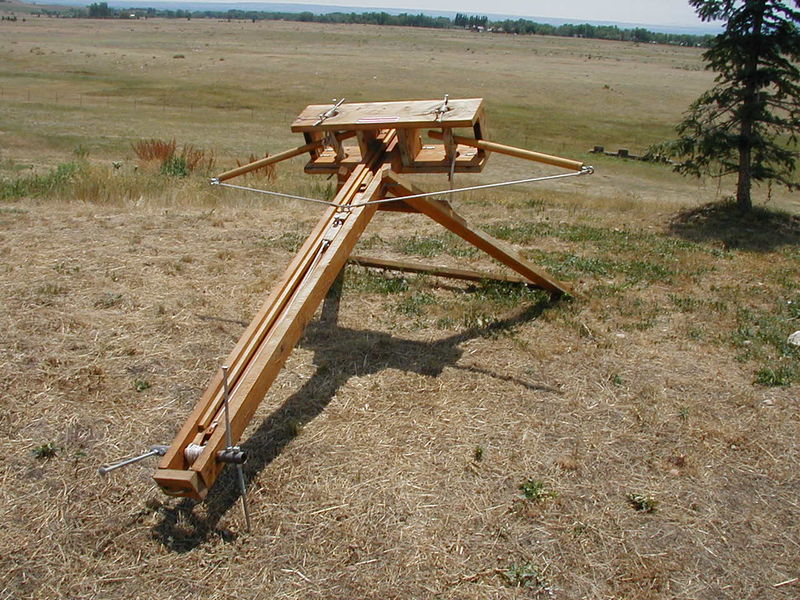
Greek Oxybeles
Greek Gastraphetes
The book A Global Chronology of Conflict: From the Ancient World to the Modern Middle East talks about an oxybeles from around 330BCE had a 9-foot bow and shot 6-foot bolts from a double-slotted slider. This bolt length is exactly what is described in our source text for this design. Useful proportions.


The torsion spring was invented and we were able to make ballistas.
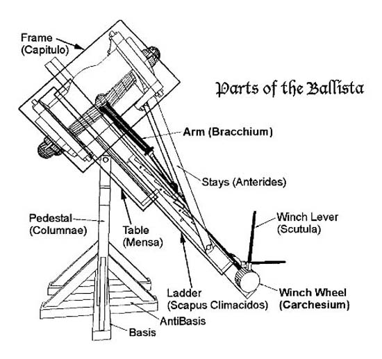
Torsion spring - a spring that stores energy when twisted. From imagery of ballistas, I believe we're looking at a torsion fiber system, where a fiber of silk under tension that gets twisted around an axis to store energy. Wikipedia states that the springs consisted of loops of twisted skeins (ropes).
The torsion spring allows for more energy to be stored than in a regular composite bow system, which means more power can be delivered - important for something intended to be so powerful!


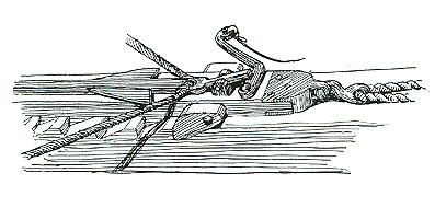
Image above of a ballista. We can see the wound ropes (skeins) through which the arms are placed near the front of the device. As the slider is pulled back along the length of the body, the arms are pulled back too and the ropes (skeins) are twisted and tensed and energy is stored. Like twisting an elastic band - these ropes want to return to their natural relaxed position. So when a bolt has been placed on the slider and the slider has been released, the ropes snap back to their relaxed state, pulling the arms forwards and thus launching the bolt.

Siege-engine.com suggests that the arms (prods) be bulky and strong, but somewhat tapered to help with acceleration.


Trigger? Greek Palintone Stone Throwing Siege Ballista uses a string and bar and the operator pulls the string, which pulls the bar out and releases the mechanism.


Wiki article on Roman cart-mounted ballista - the 'Carroballista'.

 Crossbow mechanisms - not very important, as Detritus has removed the windlass and simply draws the string by hand. 

Windlass:


Materials: 
  • Wood
  • Sinew, rope
  • Steel for bows in the case of the Arbalest and in other crossbows - in the case of the Arbalest this enabled much higher draw weight due to higher tensile strength of steel

Research outcome:


The overall shape of the ballista is a lot less familiar to the viewer, and I feel that it may be too misleading and tricky to display clearly it's function and purpose given the varied and unusual way the viewer will see it, i.e., not on a castle wall or surrounded by a crew on a field of battle, but in the hands of a troll in several different city locations.

Let's use the general crossbow shape, as in the Oxybeles. We see smaller crossbows carried by men often, and it gives us a more easily accessible read to start with.


Visual Research - References
Collected reference images can be seen here - link 

Select references from link above:
A fan depiction of Detritus with his weapon.
What I discussed above regarding the ballista being a tricky one to show clearly in such an unusual context. The bit at the front of the ballista here somewhat resembles a bi-plane, or the overall form could resemble a club or some sort of signalling device. The COMPLEXITY of the device is also something that I don't see Detritus getting along well with - large, clumsy and (unfortunately) unintelligent troll fingers wouldn't, I think, get along well with fiddly repairs. A real bow shape feels a lot more simple, primal and appropriate for a troll to use.


More ornate. Overall shape feels far more long-ranged, like a sniper rifle. However, technically, small bow implies lesser strength, thus lesser range.


Very ornate and fragile - not powerful; the shape of the body wouldn't support the compression forces put on it by a heavily tensed bow. No visible cocking mechanism - would have to be cocked by hand. Therefore - a relatively low draw weight and low power.
Very feminine in terms of form - many curves and floral inlays. Colour and tones are also quite feminine - low contrast of colours and tones. Colour mood created is feminine - white ivory with SHINY gold. Lack of imperfections implies it's brand new or very cared for. Materials and detailing imply wealth, nobility, or a wealthy/nobility-based fantastical user - angels, cherubs, elves, etc.

Material contrast draws the eye to the handle - our primary point of interaction as a user. the lines of the body and arrow draw our eye to the front and the point, while the shape of the bow returns us backwards to the string. 


Somewhat more masculine, especially the dark metal bow at the frong. The curved shapes and doe-coloured wood feels slightly feminine. The more simple wood with some decorative detailing implies perhaps a somewhat noble user, but not excessively.

 More realistic form - this is a weapon designed for power. Stirrup at front indicates a belt-cocker may be used, which would also imply more power than hand-cocked.
Visually, the slender bow implies less power. Compared with the following.


which has a quite thick bow, which implies more power.
This one has a winching mechanism and feels like more power.


Design - Dis-Organiser (Final, discussion)

Monday, 30 September 2013

Design - The Disorganiser - (Making cont.)

Colour reference collected here - link

Idea was to capture colours that suggested that the product was expensive and well-crafted, designed to last.

Reds golds and browns were my primary focus. I wanted a lot of wood and metal to create something that was robust and fit within the time period and matched the materials and technology of the period.

click image to enlarge

I did the B series first, then went back and copied the colour scheme onto the A series from right to left.

A big question I faced here was - would Sybil (Vimes' wife) purchase something that looked showy and lush, knowing how much he hates that sort of thing, or would she buy him something that, aesthetically, suited his personality? Bear in mind her tendency to encourage him to take part in the higher part of society and also her understanding of how much he dislikes taking part.

Roll a dice? The result: make it look like it suits Vimes' personality. So ditch the red.

A2 and B2 use a medium toned wood with a gold trim, and light wood to pick out the buttons and door.

A3 and B3 use a red painted or felted wood with occasional gold trim, exposed darker wood with a gold-plated paper patch and light wood to pick out the buttons. In B3 there light wood is only used for the buttons, and as such they become too prominent. Also the contrast surrounding the buttons is too dominant.
The red and gold create a sense of affluence and lushness, also quite showy - unlike Vimes.

A4 and B4 - tried out a lighter wood trim around a darker wood base. Played with picking out the door in dark red and then repeating this dark red on buttons, etc, to tie it in. Could darken horns to push them into background a bit more. A fair amount of detail on side lost in the dark wood too. White trim feels like bone - gives it a more spooky, darker feel.

A5 and B5 - too few colours, too monochromatic. Didn't bother repeating for A.

A6 and B6 - bright red and gold look very childish - red should be darker and richer.

A7 and B7 - Tried lighter wood colours and a more silvery metal. I feel the gold creates a more expensive looking product.


Revised version:
Gold or brass trim adds a bit of style and expensiveness, but also practicality - the wood won't chip, etc around the edges. Brightened the gold on the lid, and subdued the horns - these can be a darker metal - maybe brass. Added lighter wood to bring out the detail along the side. Very dark reds gives a more serious and less flamboyant look. Brightened border of buttons to frame them nicely and make them slightly more dominant

Friday, 27 September 2013

Research (artist work critique, social) - Menter's Mantis painting

User Menter on the Facepunch Forum Creative Work thread posted the following image


Originally a study from a photo of war-torn Syria, turned into a more fantastical composition


My criticism - the placement and shape of the Mantis isn't helpful for the composition - both the actual direction the mantis is facing as well as the abstracted forms of the legs and claw serve to lead the eye off the right edge of the page. 

If this is desired for conceptual reasons, fine. The current image does tell the story of a soldier observing this creature pass by in the distance, which (depending on the specific brief) may be appropriate.

I feel a more intimate relationship could be set up between the mantis and the figure, and the eye could be contained within the image better if we changed the posture of the mantis.

I mentioned this and Menter noted that the eye of the mantis is looking at the soldier - this is very tiny details and doesn't help the overall initial read though. Paintover below.


I changed the height of the legs so that they sloped downwards, leading the eye leftwards. Also the overall twist of the body and the raised claw also lead the eye towards the soldier.  Antennas lead the eye down towards the head, and from here the flow of the body curves downwards to the street - or we may follow the point of the claw.

I feel as though the foreground could be brought out more to clarify the form of the soldier - perhaps a lighter background behind the soldier so that his right edge isn't lost.